Dive Brief:
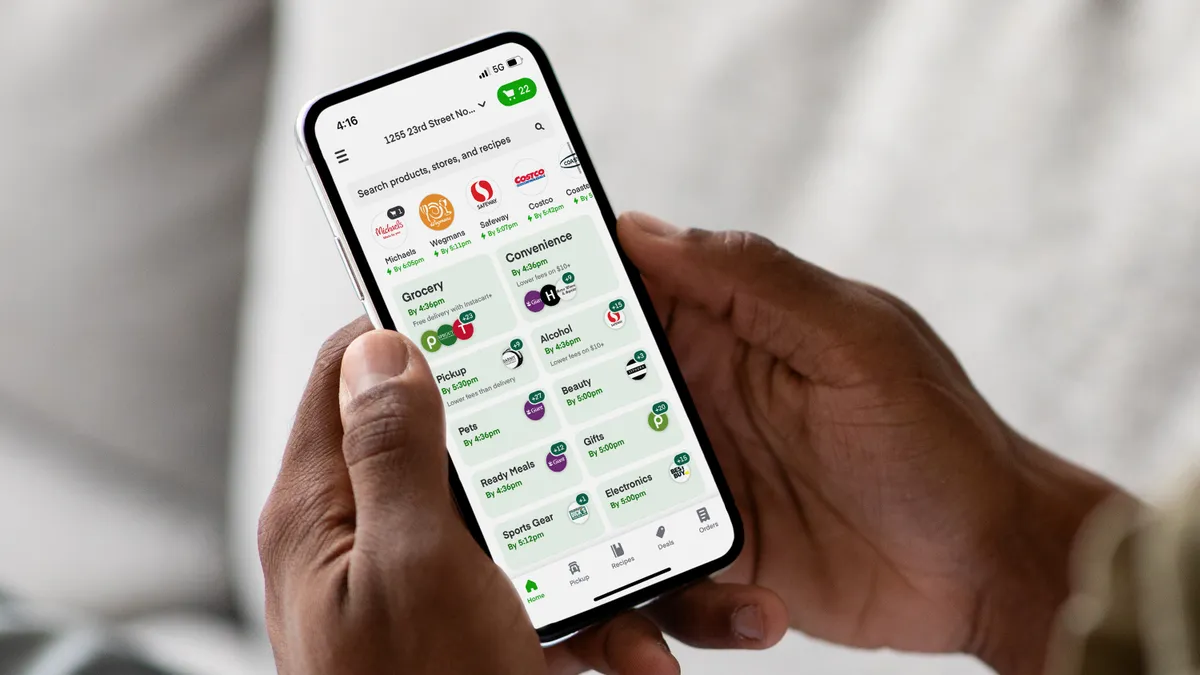
- Instacart has made recent changes to its online marketplace that let customers begin shopping by selecting the category, need or channel before choosing the retailer. That ability to shop by use-cases for grocery and non-food items is now prominently featured on its home feed.
- Shoppers on both the app and web browser will see green boxes representing each category, including grocery, pets, sports gear and beauty. Within each box, there’s an estimated delivery time and logos of suggested local retailers they can order items from.
- In the future, Instacart aims to use the redesigned home feed to focus more on personalization and certain time-bound occasions, like holidays and seasonal events, and dietary restrictions, an Instacart spokesperson wrote in an email.
Dive Insight:
With the changes to its home feed, Instacart is not only accentuating the different use-cases shoppers may have but also paving the way for more personalization.
The spokesperson said the goal of the redesigned home feed is to give customers more inspiration and avenues to explore items they may need at a given moment. The updates to the home feed on its app rolled out over the last few months, and the home feed refreshes every session with targeted content, the spokesperson said.
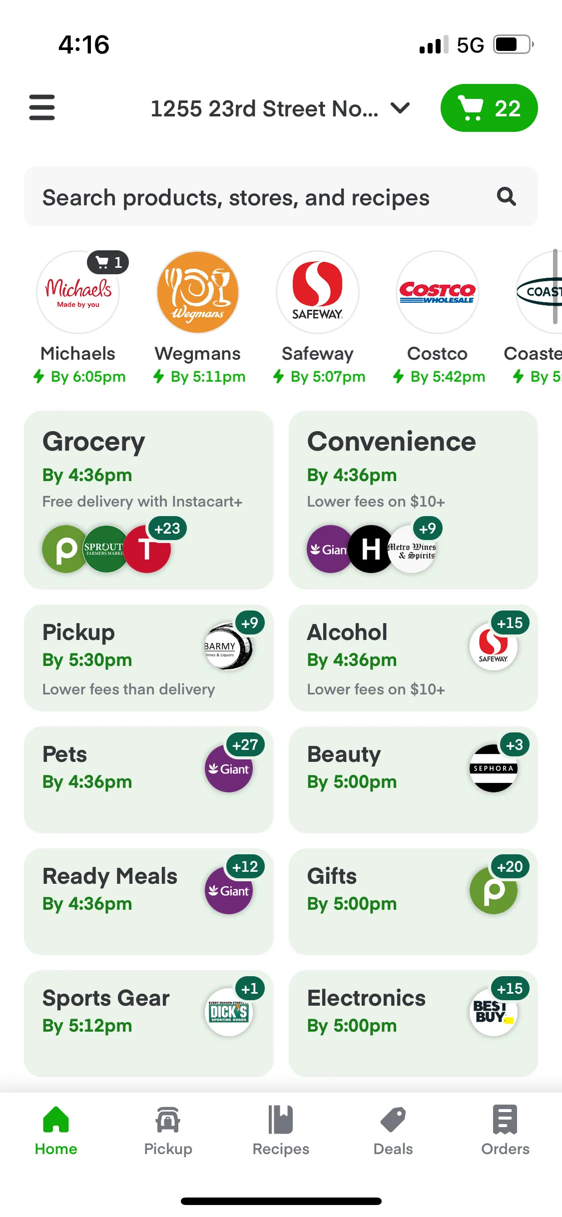
In addition to highlighting its food and non-food products, it’s also spotlighting its Ready Meals, the in-app hub for prepared meals from grocery stores the company announced at the start of this year.
Pickup, which has its own tab, also has its own green use-case box reminding customers the service is available. Pickup continues to remain popular with customers — especially among those worried about getting infected with COVID-19 — and usually carries lower or no fees compared to delivery, which may be particularly attractive to shoppers grappling with high food prices.
The home feed design is similar to DoorDash, Uber Eats and instant delivery firms, which show different categories and uses customers can select along the top. For both DoorDash and Uber Eats, the grocery, convenience and alcohol categories receive top billing, but neither shows the estimated delivery times for each category like Instacart does.
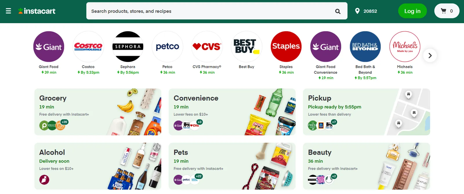
The design of the boxes on the web version of Instacart’s marketplace includes pictures of specific products, like bananas and avocados for “Grocery” and Sprite and Advil for “Convenience.” It’s visually akin to the product-focused visuals of in-app categories for instant delivery firms, such as Gopuff and Gorillas.
Even though select retailer logos appear in the green boxes alongside a bubble that says how many nearby retailers stock items for each group, the changes to the home feed have Instacart straddling the line between emphasizing specific retailers versus what kind of products shoppers need.
By showing on the home feed when customers can expect items for each use-case, Instacart helps spotlight its push into faster delivery times, including a 15-minute delivery service for retailers that’s powered by “nano-fulfillment centers” and virtual convenience stores with grocery partners.


